The AI generated logo, landing page or poster looks finished to you, and the first real designer who sees it spots the problem in seconds. Prompting for design without design knowledge is pure luck, and color theory is the first place that luck runs out. I know this because I shipped UI and pictures that looked good to me and did not look good to anyone else.
This post is for creatives and designers who use AI for graphic design and want output they can defend to a client or a lead. I will cover what went wrong for me, the design principles that fix it, checked against real sources, and AI design prompts plus a checklist you can use today. AI is software, garbage in gives garbage out, and nothing it makes is perfect, so the target here is control, not perfection.
Why AI Graphic Design Is Luck Without Design Knowledge
AI is software, and software returns what the input earns. A prompt like “make a modern logo for my brand” carries nothing about color relationships, hierarchy, audience or brand, so the model fills every gap with the most common answer. Garbage in, garbage out still holds when the garbage comes back rendered in high resolution. Nothing it returns is perfect either, so every output is a draft you inspect and fix.
People hear that someone used AI and assume that person knows nothing about design. That is the wrong conclusion. A novice using AI for graphic design will get okay work, something that fills the frame and survives a quick scroll. A person with real design training gets a much better result from the same tool, because they know what to ask for and what to reject. That is a force multiplier, and I made the same point about using AI writing as leverage, and the same logic holds here, because a multiplier applied to zero knowledge still returns zero.
In my experience a blind prompt wins about four tries out of ten. The win rate is not the real problem, since the real problem is that you cannot tell why a try won, so you cannot repeat it. Design concepts are what make the wins repeatable.
What Designing With AI Taught Me
The first thing I noticed is that AI overwrites your idea with the internet average. I touched on that in AI at work replaces what you know, and design shows it faster than writing does. Ask for a layout and you get the layout everyone else’s prompt produced, because it is what the model has seen most. If you have a direction of your own and you do not state it, it gets replaced.
It also lowered the standard. Making a picture or a layout now takes seconds, so quantity beats quality, and people publish the tenth variation instead of asking whether the first one was right. The tool made volume cheap, which makes judgment the scarce part.
My own work proved it. The UI and pictures I made with AI looked good to me and did not look good to other people. The UI felt intuitive to me only because I was used to it, and I had built it, so I knew where everything was. A lead designer told me to go study UX, and that was the right call. I went and studied color theory, typography and cognitive load, and I could finally say why something looked wrong instead of just sensing it.
Some failures are obvious and some are not. A hand with the wrong number of fingers, seven where there should be three, is wrong to anyone at a glance. Leon Kennedy riding a scooter that is not in the game is an entertaining picture, because the error is loud and harmless. The errors that cost you are the quiet ones, like clashing colors, weak hierarchy, hard to read text, and a brand that drifts between assets, and those pass as fine until a designer or a client looks.
It is the same pattern as my interview. They liked my articles until I mentioned Claude and the multiple checks with multiple AI reviewers, and then the work suddenly became nothing to them, even though not a word had changed. AI has a bad reputation because of unskilled use, and skilled use gets lumped in with it. That is why I would rather teach the concepts than tell anyone to just use better prompts.
One more thing about tools. I see people stacking Jasper, a humanizer and a few other subscriptions to patch the gaps, when a general tool with good skills and your own knowledge gets you a controllable result. A specialized tool is fine if it is your main job, but it does not replace knowing the craft. I keep a separate look at what is worth paying for in solo content creator tools.
Color Theory and the Design Principles AI Does Not Apply For You
Color theory is where I started, and it is the fastest way to see what blind prompting misses. The model can produce a palette, but it cannot tell you whether the palette fits the audience, the brand or the reading conditions. These design principles are the checks I now run on any AI graphic design output, each one verified against a source.
Color theory basics
Color theory studies how colors work together and how they affect perception. The color wheel is credited to Isaac Newton in 1666, and Goethe’s Theory of Colours in 1810 covered the psychological effects of color. A color has three properties: hue, which is what makes it red or blue, value, which is its lightness or darkness, and saturation, which is its purity and vividness. Complementary colors sit opposite each other and give maximum contrast, analogous colors are neighbors on the wheel, and triadic colors sit 120 degrees apart. Warm colors like red and orange read as energetic, and cool colors like blue and green read as calm, which is exactly the kind of decision a prompt should state instead of leaving to chance.
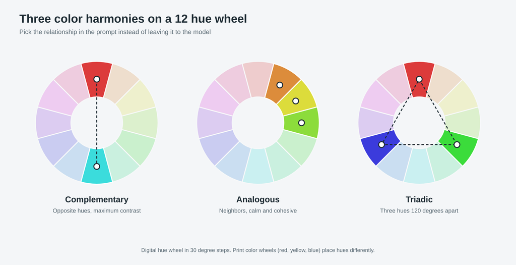
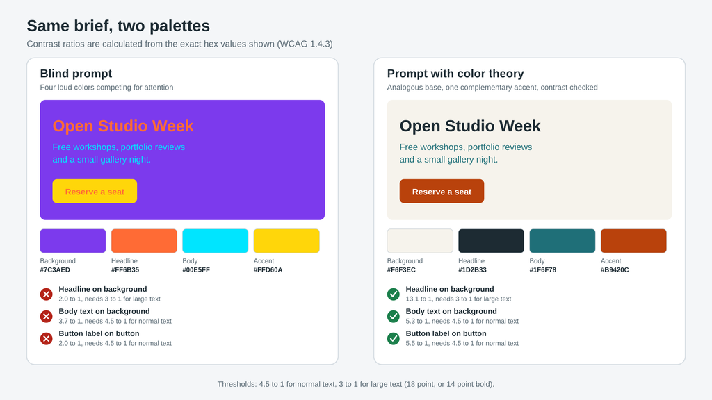
Harmony is not the same as legibility. WCAG success criterion 1.4.3 requires a contrast ratio of at least 4.5 to 1 for normal text and at least 3 to 1 for large text, where large means 18 point or bigger, or 14 point bold. A palette can look balanced and still fail that test, and AI will not warn you.
Typography and type hierarchy
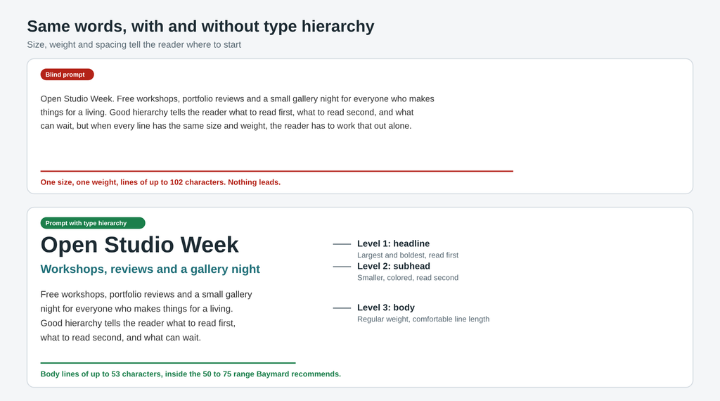
Typography design is how type is chosen and arranged so the reader knows what to read first. Hierarchy comes from size, weight and spacing, and it decides whether a headline, a subhead and body copy feel like three clear levels or one blur. Line length matters too, since research from Baymard puts comfortable body text at about 50 to 75 characters per line, with Emil Ruder suggesting 50 to 60 and WCAG advising no more than 80. Typography also does brand work, because it affects how a brand feels before anyone reads the words.
Composition and visual hierarchy
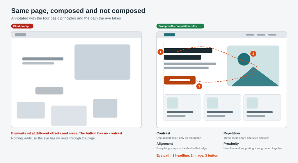
Composition design is where the eye lands, in what order, and why. Robin Williams boiled the basics down to four principles in The Non-Designer’s Design Book, which are contrast, repetition, alignment and proximity. A layout that follows them reads in a clear order, and one that ignores them looks busy even when every element is individually nice. Ask the AI to explain where the eye lands first, second and third, and if the answer is vague, the composition is too.
Brand identity and brand guidelines
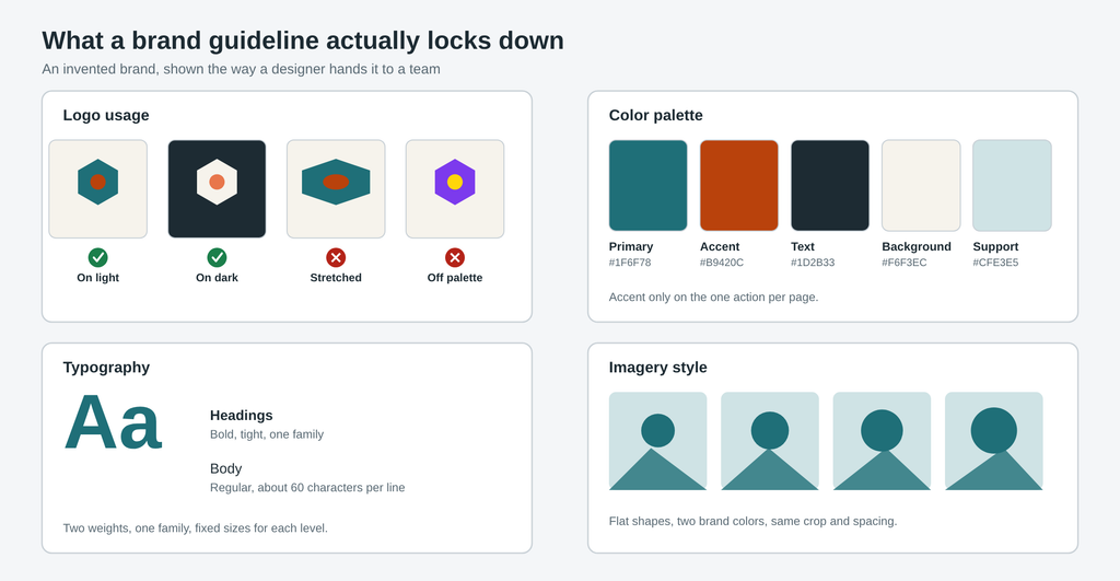
Brand identity is the foundation, meaning the mission, values, positioning and personality. Brand guidelines are the documented standards that make that identity usable, covering logo usage, the color palette, typography, imagery and voice. Without them, AI produces a new interpretation of your visual identity every time you prompt, and the assets drift apart. This is the single biggest reason I hand the model the guidelines instead of describing the brand from memory.
UX design principles and cognitive load
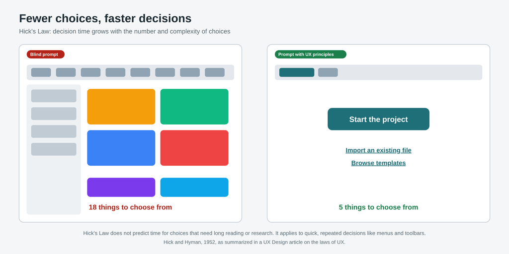
UI UX design is judged by how people use the thing, not by how it looks in a mockup. Jakob’s Law, from Jakob Nielsen, says users prefer your site to work like the other sites they already know. Hick’s Law, from William Edmund Hick and Ray Hyman in 1952, says decision time grows with the number and complexity of choices. Miller’s Law, from George Miller in 1956, puts working memory at about seven items, plus or minus two, though the sources I checked warn against using that number as a hard design limit. Fitts’s Law, from Paul Fitts in 1954, says the time to reach a target depends on its distance and size.
These are the UX design principles behind cognitive load, which I went deeper on in cognitive load theory for freelancers. They also explain my own mistake, because the designer is the worst tester of their own user interface design. I found my own UI intuitive because I knew it, and that feeling told me nothing about whether new users would find it familiar, which is the question Jakob’s Law asks.
I made the same case for writers, where story structure does the job that these principles do for design, in how story structure turns lucky AI writing into writing you can control. Different craft, same rule, and the model does not know the concepts unless you do.
AI Design Prompts That Carry Design Knowledge
These AI design prompts are templates, not magic. Fill the brackets with your own audience, palette and brand rules, because the concepts only help when your knowledge is in the slots. Change the wording until it sounds like you, and expect to run each one more than once.
# Color and contrast
Design a [asset] for [audience]. Use a [analogous / complementary / triadic] palette with one accent color, and give me the hex values. Body text must meet a 4.5 to 1 contrast ratio and large text 3 to 1. Tell me which colors you used for background, text and accent.
# Typography
Use one type family with two weights. Set a clear hierarchy of headline, subhead and body, and list the sizes you chose. Keep body line length between 50 and 75 characters.# Composition
Apply contrast, repetition, alignment and proximity to this layout. Then tell me where the eye lands first, second and third, and why. If any element competes with the first focal point, say so.# Brand consistency
Here are my brand guidelines: [logo rules, palette, typography, imagery style, voice]. Produce [asset] that follows them, and list every place you deviated from the guidelines.# UX review
Review this interface as a UX reviewer. Check it against Jakob's Law, Hick's Law and cognitive load. List every place where the user faces too many choices or an unfamiliar pattern, and say what to remove or change.For a harsher pass, I run the output through a critic prompt that is told not to praise, in the same way I use the approach in my editorial auditor prompt for writing. Swap in color, type, hierarchy and brand fit as the checks, and have a second reviewer look at the result.
Checklist before you accept an AI design
This is the list I run on every AI graphic design output before it goes to a client or onto a page. It also works as a way to learn design principles, since every item forces you to know the answer yourself.
- Did I state the palette type and the accent color in the prompt, instead of leaving them to the model?
- Does body text meet 4.5 to 1 contrast and large text 3 to 1?
- Is there a clear hierarchy of headline, subhead and body, with body lines between 50 and 75 characters?
- Can I say where the eye lands first, second and third?
- Does it follow my brand guidelines, with logo, color and type consistent with my other assets?
- Would a first time user know what to do, without me explaining it?
- Did someone other than me look at it, a designer or a client, before I called it done?
If an item fails, fix the prompt or the input first, then regenerate. That is the whole loop, and it is the difference between a lucky win and a result you can repeat.
If you are still working out which tools belong in your stack once the concepts are in place, AI tools for remote work is where I would go next.